

RAFFLES CONNECT • HANDED OFF 2025
Raffles Connect Redesign: From Distraction to Harmony
TIMELINE
2025
ROLE
Senior Product Designer
SCOPE
Data Analysis, Information Architecture, UX/UI Design, Usability Testing
Overview
Since launching in 2017 as a simple teleconsultation and appointment booking tool, Raffles Connect has steadily expanded to cover a wider range of health and wellness services.
In early 2025, driven by a user-first approach, we redesigned the information architecture and interface to restore clarity and create a more intentional experience.
Initial finding
Users were overwhelmed by too many features, making it hard to complete essential tasks.
Feedback revealed that users struggled to navigate the app, often feeling lost or distracted from their goals. The biggest pain points were difficulty locating specific features and feeling overloaded by a busy interface.
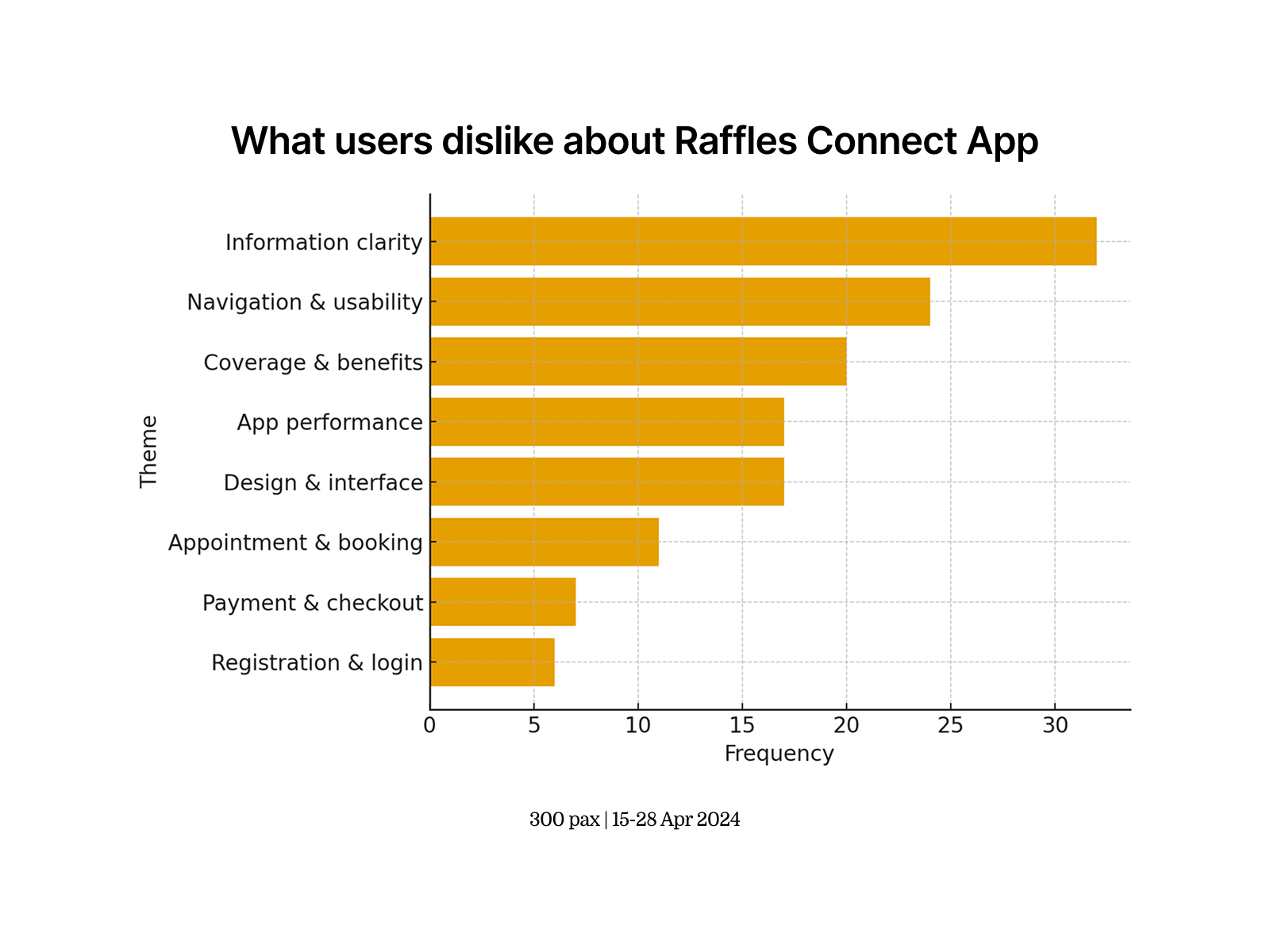
User feedback highlighting frustration with navigation and information clarity.
Data analysis
Behavioural data confirmed the gap between what we offered and what users valued.
Heatmap analysis showed minimal engagement with supplementary features like the habit builder and health articles, while core services—such as booking appointments and accessing medical records—were consistently used, signalling where we needed to focus.

Heatmap data showing high engagement with core services and low engagement with supplementary features.
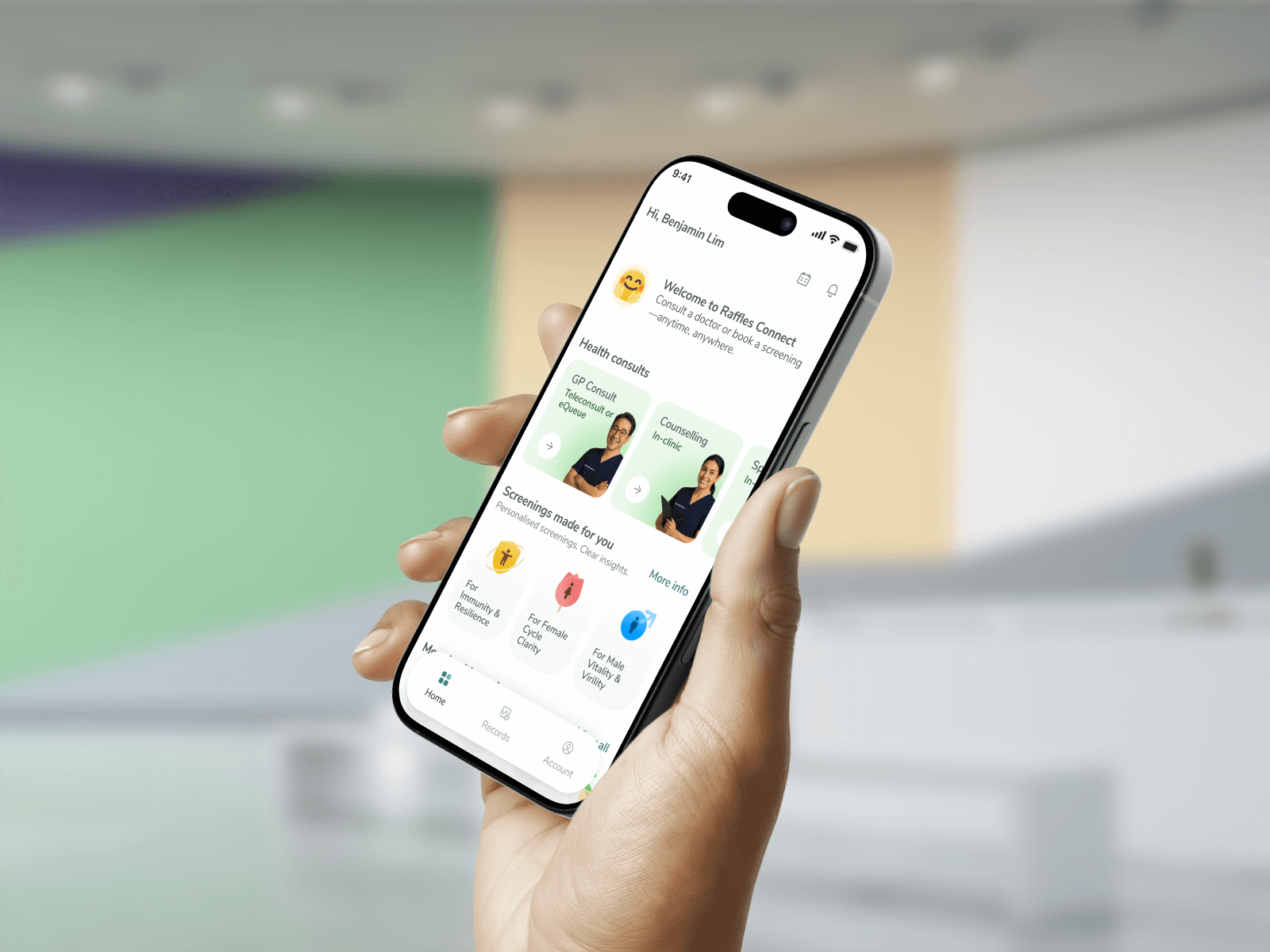
Decluttering the navigation
We simplified navigation to highlight only the services users valued most.
By removing underused features from primary navigation and restructuring the hierarchy, we focused the app around core offerings: teleconsultations, health screenings, and medical services. This helped reduce friction and expedite feature discovery compared to the previous design.

Comparison of previous navigation (left) with simplified, user-focused navigation (right).
Usability testing
Reducing cognitive load improved usability more than simply reducing steps.
During testing, users found the consultation method toggle on the home screen confusing and mentally taxing. We removed it, prioritising clear navigation over fewer taps. This reduced mental strain and improved overall flow.

Removing the consultation method toggle reduced user confusion and improved decision-making.
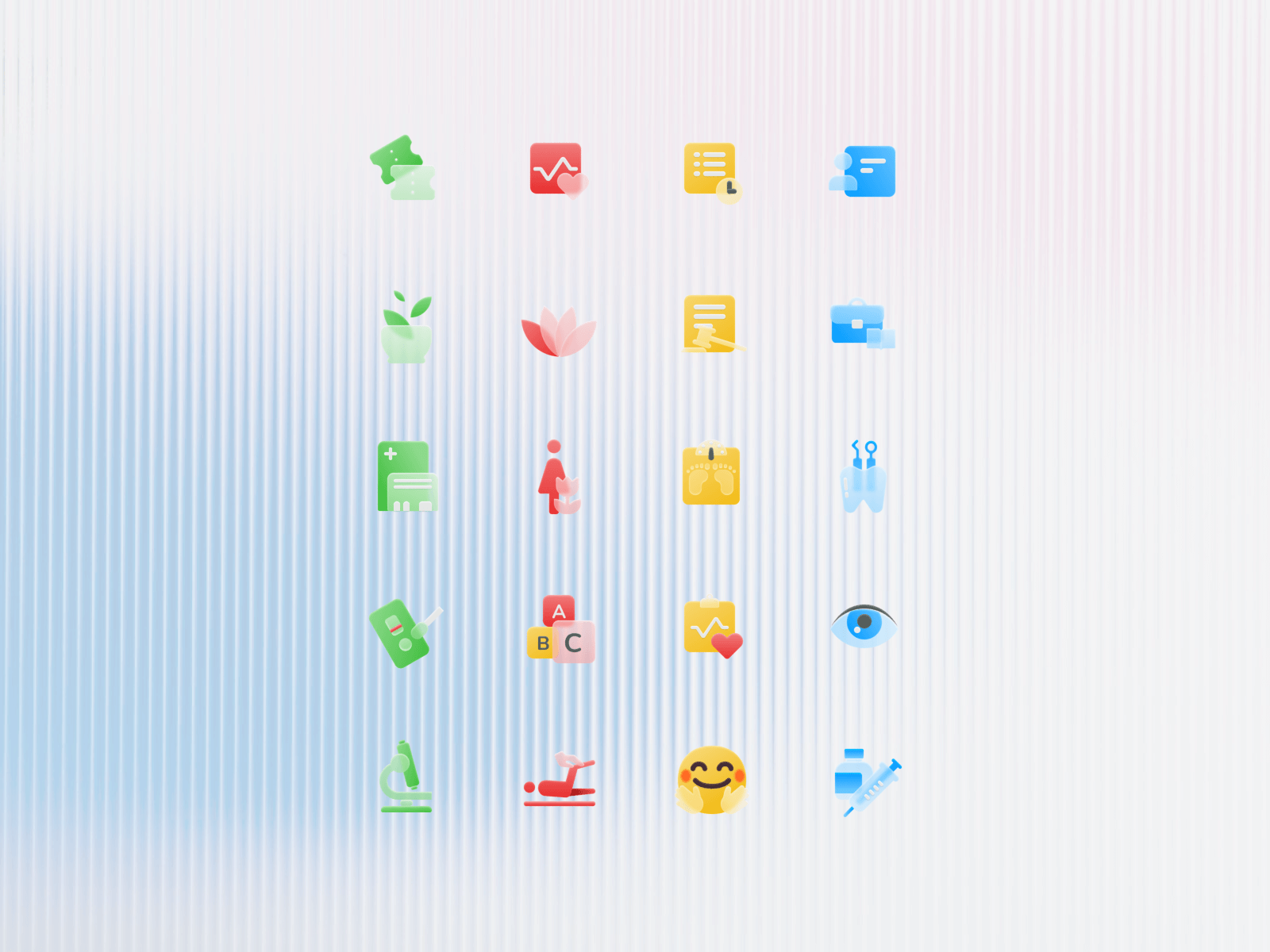
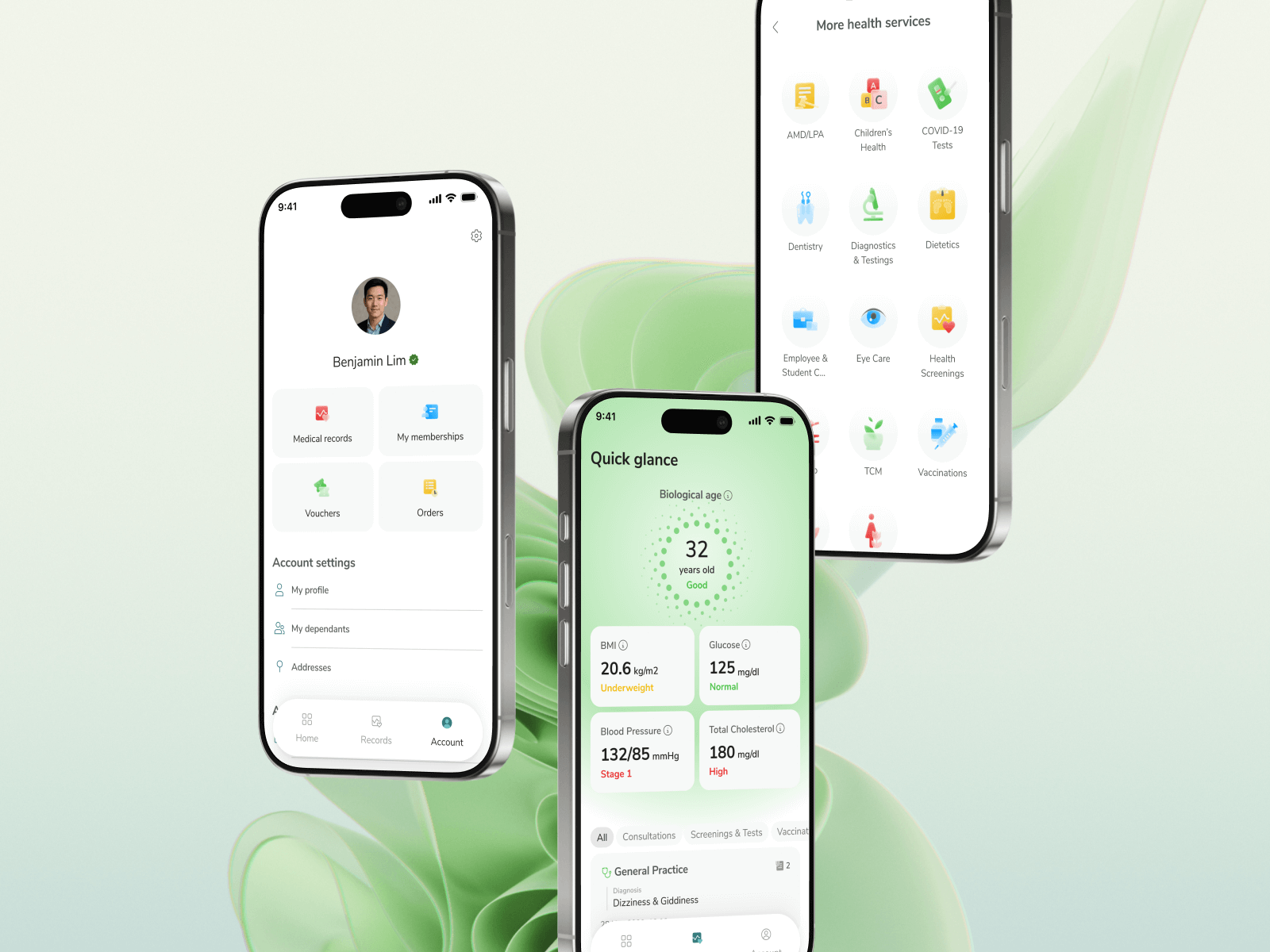
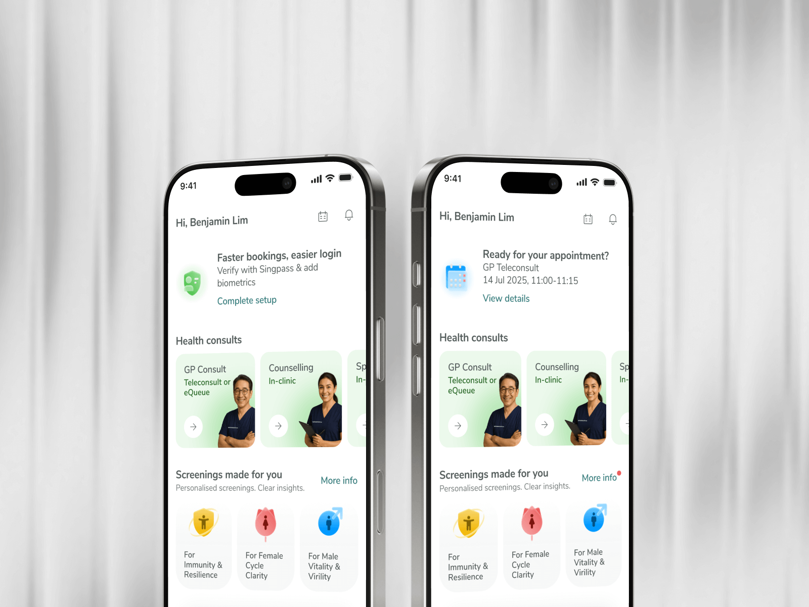
Enhancing & refreshing design language
While the revised information architecture improved clarity, the updated design language made the experience more engaging and approachable.
We introduced bolder colour palettes, colourful illustrations, and friendly models to convey care and reliability. Internal surveys showed an increase in positive sentiment toward the app’s look and feel.


Visual refresh emphasising warmth, personal connection, and service transparency.
Impacts
70
task success rate in usability testing, validating clearer navigation and structure
78
of participants reported that the new hierarchy effectively guided their attention and felt more intuitive