RAFFLES CONNECT • SHIPPED Q3 2024
How We Turned Checkout Confusion into Conversion
TIMELINE
2024
ROLE
Senior Product Designer
SCOPE
Data Analysis, Design Heuristics, UX/UI Design
Overview
General Practice Teleconsultation accounts for 50% of Raffles Connect’s GMV. However, an unoptimised checkout screen led to a potential 28% loss in GMV.
In this project, I analysed and redesigned the checkout experience, improving success rates by 3% and reducing user confusion by 14%.
Problem Scoping
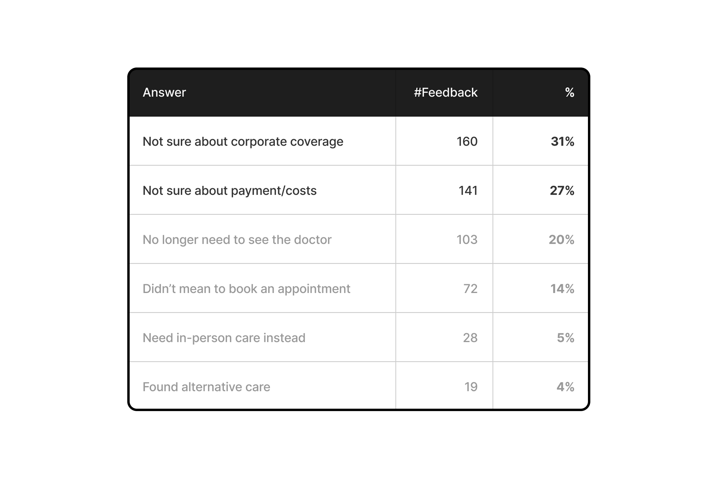
User feedback and survey data revealed two critical pain points behind checkout drop-offs:
-
Uncertainty about costs: Users couldn’t see the final price during check out.
-
Confusion over corporate coverage: 65% of GP Teleconsults come from corporate users who typically don’t pay out of pocket, yet the app didn’t clarify if their coverage applied.
Abandonment survey before redesign.
Design Audit
Three key UX issues emerged:
-
No final price shown
Total price didn’t show the final price after discounts or extra fees. -
Ambiguous coverage messaging
Lack of clarity on corporate entitlements discouraged usage. -
Poor communication of charge timing
Visuals were overlooked, and the message wasn’t reassuring.
Design Heuristics
I studied checkout flows across leading platforms and extracted three heuristics that shaped our redesign:

No Second Guessing
Checkout screens must clearly explain payment terms and conditions.
- Lyft clearly highlights that the total price is an estimate and payment is postpaid.
- Expedia specifies that payment is required only to hold a reservation.

Smart Suggestions
The system should preselect the most relevant options to reduce effort.
- Lazada defaults to the most recently used card, speeding up checkout.
- Grab auto-applies eligible vouchers and promotions before payment.

Minimise Distractions
Only essential details should appear at checkout to reduce friction.
- Shopback and FoodPanda simplify their checkout screen so users can focus on payment without being overwhelmed.
Final Design
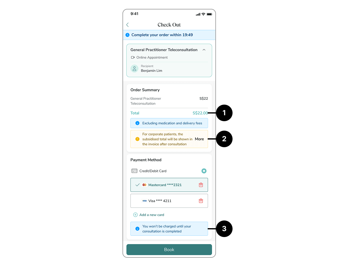
Guided by these principles, I redesigned the checkout screen to reduce distractions and remove second guessing.

Corporate users can instantly see how much they owe and whether coverage applies.

The most critical information is shown first–explicitly stating that card details are only for booking confirmation–with supporting actions (choose card, add card) following naturally.

The button itself acts as both a call-to-action and a reassurance, reducing reliance on separate messages.
Prototype
Impacts
75
-14

Checkout conversion rate before and after redesign.


