RAFFLES CONNECT • SHIPPED Q2 2024
Reclaiming Attention to Reignite Core Product Growth
TIMELINE
2024
ROLE
Lead Product Designer
SCOPE
Data Analysis, Design Heuristics, UX/UI Design
Overview
After COVID-19, Raffles Connect saw a drop in active users. To regain traction among corporate clients, we evolved the product from a teleconsultation app into a holistic health platform.
We introduced features such as health and wellness programmes, activity challenges, and other employee engagement tools. But as more features were added to the home screen, it became harder for users to stay focused on their core jobs to be done.
Findings
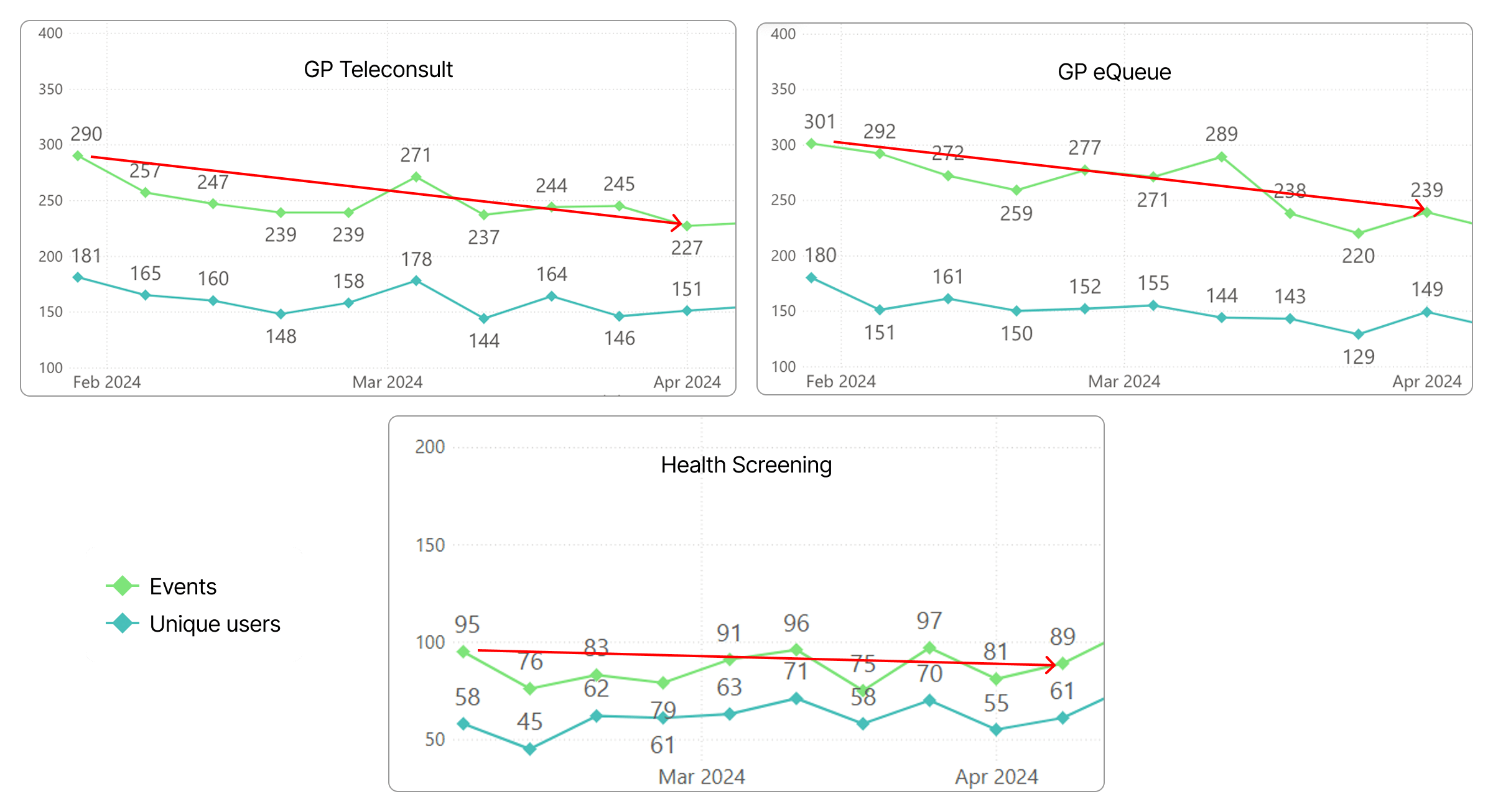
The findings supported our hypothesis: Q1 2024 data showed a clear decline in CTR and unique users for our core products.
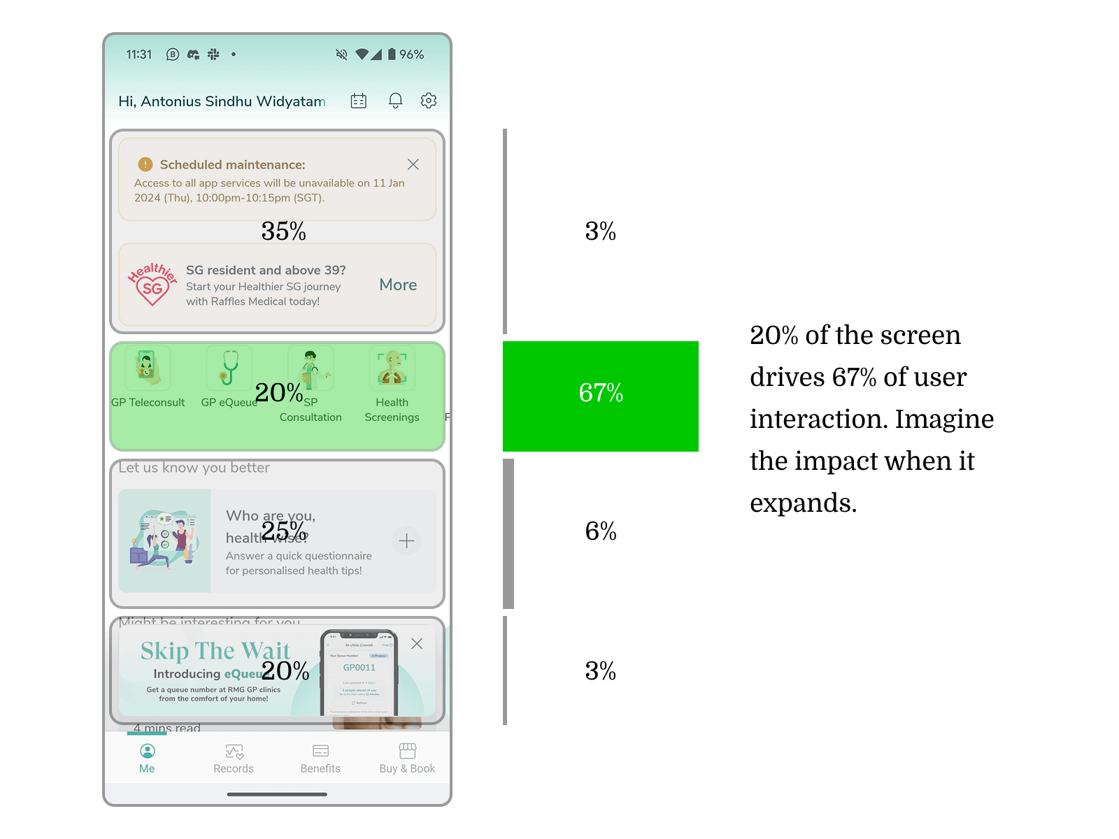
Heatmap data also revealed a strong imbalance—core products occupied only 20% of the screen yet generated 67% of total interactions—indicating that the layout didn’t reflect their true business value. This confirmed the need to redesign the home screen to prioritise these features appropriately.
Approach

Doubled the service real estate
I increased the screen space for high-value services, positioning them as the hero section. This improved visibility and enlarged touch areas guided users’ attention to what mattered most.

Introduce visual hierarchy
I restructured the service tiles to establish a clear order of importance, guiding users’ attention and helping them navigate and identify key services more easily.

Encourage decisions with subtle cues
I added contextual hints—such as doctor availability and nearest clinic distance—to encourage users to make informed decisions naturally, without overwhelming or pressuring them.
Final Design

Impacts


